

Introduction
Creating a website from scratch may seem challenging, but with HTML and CSS, you can easily design a functional and visually appealing site. Whether you’re a beginner or someone looking to refresh their skills, this website tutorial for beginners will guide you through the essential steps. By following this HTML CSS guide, you’ll understand how to structure a webpage, style it, and make it accessible to users. Let’s dive into the process of how to build a website using HTML and CSS step by step.
Step 1: Setting Up Your Project
Before you start coding, you need to set up your project files properly. This ensures better organization and makes it easier to manage your website.
Steps:
- Create a new folder on your computer and name it “MyWebsite”.
- Inside this folder, create two files:
- index.html (for the main webpage content)
- style.css (for styling your webpage)
- Open these files using a code editor like VS Code, Sublime Text, or Notepad++.
Having a well-organized structure will make coding easier and more efficient. You may also want to install a browser like Google Chrome or Firefox for testing your website as you develop it.
Step 2: Writing the Basic HTML Structure
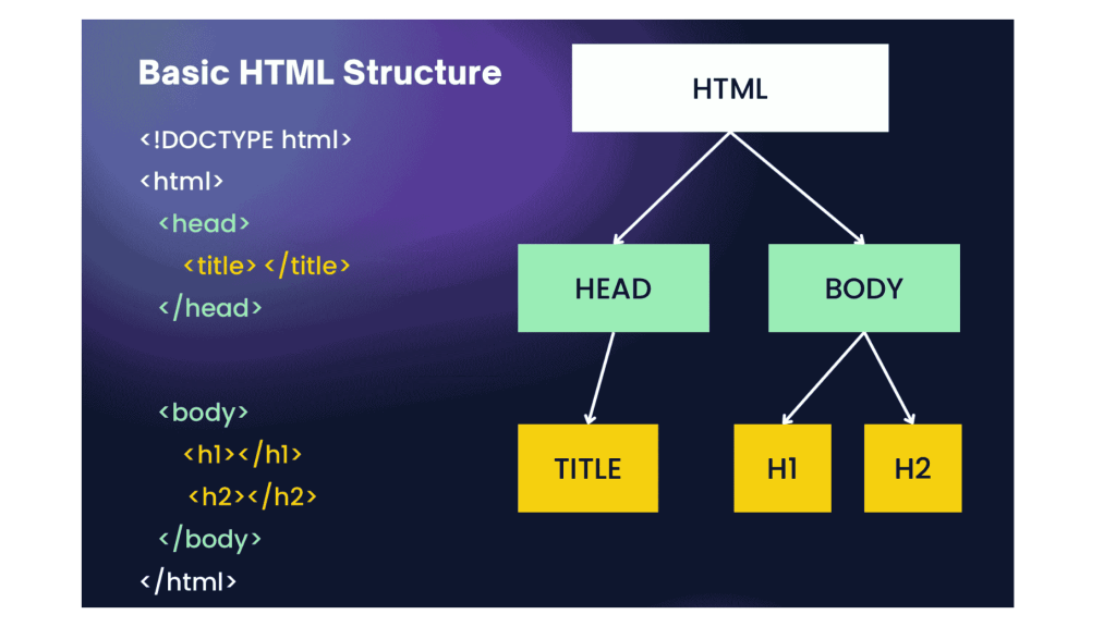
HTML (HyperText Markup Language) forms the backbone of a website. It defines the structure and content of your webpage.
Understanding the Basic HTML Structure:
- The
<!DOCTYPE html>declaration defines the document type. - The
<html>tag encloses all content on the webpage. - The
<head>section contains metadata, including the title and links to CSS files. - The
<body>section contains all visible content like headings, paragraphs, and images.
Basic HTML Code:
<!DOCTYPE html>
<html>

<head>
    <title>Simple web page Template</title>
    <link rel="stylesheet" href="style.css">
</head>

<body>
    <nav class="navbar background">
        <div class="logo">
            <img src="https://media.geeksforgeeks.org/gfg-gg-logo.svg" style="height: 30px;" alt="Logo">
        </div>
        <ul class="nav-list">
            <li><a href="#web">Web Technology</a></li>
            <li><a href="#program">C Programming</a></li>
            <li><a href="#course">Courses</a></li>
        </ul>
        <div class="rightnav">
            <input type="text" name="search" id="search">
            <button class="btn btn-sm">Search</button>
        </div>
    </nav>

    <section class="firstsection">
        <div class="box-main">
            <div class="firstHalf">
                <h1 class="text-big" id="web">Web Technology
                </h1>
                <p class="text-small">
                    HTML stands for HyperText Markup Language.
                    It is used to design web pages using a markup
                    language. HTML is the combination of Hypertext
                    and Markup language. Hypertext defines the
                    link between the web pages. A markup language
                    is used to define the text document within tag
                    which defines the structure of web pages.
                    HTML is a markup language that is used by the
                    browser to manipulate text, images, and other
                    content to display it in the required format.
                </p>


            </div>
        </div>
    </section>

    <section class="secondsection">
        <div class="box-main">
            <div class="firstHalf">
                <h1 class="text-big" id="program">
                    C Programming
                </h1>
                <p class="text-small">
                    C is a procedural programming language. It
                    was initially developed by Dennis Ritchie
                    as a system programming language to write
                    operating system. The main features of C
                    language include low-level access to memory,
                    simple set of keywords, and clean style,
                    these features make C language suitable for
                    system programming like operating system or
                    compiler development.
                </p>
            </div>
        </div>
    </section>

    <section class="section">
        <div class="paras">
            <h1 class="sectionTag text-big">Java</h1>
            <p class="sectionSubTag text-small">
                Java has been one of the most popular
                programming language for many years.
                Java is Object Oriented. However it is
                not considered as pure object oriented
                as it provides support for primitive
                data types (like int, char, etc) The
                Java codes are first compiled into byte
                code (machine independent code). Then
                the byte code is run on Java Virtual
                Machine (JVM) regardless of the
                underlying architecture.
            </p>
        </div>
    </section>

    <footer class="background">
        <p class="text-footer">
            Copyright ©-All rights are reserved
        </p>
    </footer>
</body>

</html>
This code sets up the basic webpage structure, including a title, a heading, and a paragraph. You can expand this by adding more sections, headers, and footers as needed.
Step 3: Styling with CSS
CSS (Cascading Style Sheets) is used to enhance the appearance of your website. It controls fonts, colors, layouts, and responsiveness.
Key CSS Properties to Learn:
background-color– Sets the background color.font-family– Defines the font style.marginandpadding– Adjusts spacing.text-align– Controls text alignment.box-shadow– Adds shadows for better visual effects.
Basic CSS Code:
* {
    margin: 0;
    padding: 0;
}

.navbar {
    display: flex;
    align-items: center;
    justify-content: center;
    position: sticky;
    top: 0;
    padding: 15px;
    cursor: pointer;
}

.background {
    background: black;
    background-blend-mode: darken;
    background-size: cover;
}

.nav-list {
    width: 70%;
    display: flex;
    align-items: center;
    gap: 20px;
    list-style: none;
}

.logo {
    display: flex;
    justify-content: center;
    align-items: center;
}

.logo img {
    width: 180px;
    border-radius: 50px;
}

.nav-list li {
    list-style: none;
    padding: 26px 30px;
    padding: 10px;
}

.nav-list li a {
    text-decoration: none;
    color: white;
}

.nav-list li a:hover {
    color: grey;
}

.rightnav {
    width: 30%;
    text-align: right;
}

#search {
    padding: 5px;
    font-size: 17px;
    border: 2px solid grey;
    border-radius: 9px;
}

.firstsection {
    background-color: green;
    height: 400px;
}

.secondsection {
    background-color: blue;
    height: 400px;
}

.box-main {
    display: flex;
    justify-content: center;
    align-items: center;
    color: black;
    max-width: 80%;
    margin: auto;
    height: 80%;
}

.firsthalf {
    width: 100%;
    display: flex;
    flex-direction: column;
    justify-content: center;
}

.secondhalf {
    width: 30%;
}

.secondhalf img {
    width: 70%;
    border: 4px solid white;
    border-radius: 150px;
    display: block;
    margin: auto;
}

.text-big {
    font-family: 'Piazzolla', serif;
    font-weight: bold;
    font-size: 35px;
}

.text-small {
    font-size: 18px;
}

.btn {
    padding: 8px 20px;
    margin: 7px 0;
    border: 2px solid white;
    border-radius: 8px;
    background: none;
    color: white;
    cursor: pointer;
}

.btn-sm {
    padding: 6px 10px;
    vertical-align: middle;
}

.section {
    height: 400px;
    display: flex;
    align-items: center;
    justify-content: center;
    max-width: 90%;
    margin: auto;
}

.section-Left {
    flex-direction: row-reverse;
}

.paras {
    padding: 0px 65px;
}

.thumbnail img {
    width: 250px;
    border: 2px solid black;
    border-radius: 26px;
    margin-top: 19px;
}

.center {
    text-align: center;
}

.text-footer {
    text-align: center;
    padding: 30px 0;
    font-family: 'Ubuntu', sans-serif;
    display: flex;
    justify-content: center;
    color: white;
}

footer {
    text-align: center;
    padding: 15px;
}


.rightnav {
    width: 100%;
    text-align: right;
    margin-top: 10px;
}

#search {
    box-sizing: border-box;
    width: 70%;
    padding: 8px;
    font-size: 17px;
    border: 2px solid grey;
    border-radius: 9px;
}

.btn-sm {
    padding: 8px 20px;
    margin: 7px 5px;
}

img {
    max-width: 100%;
    height: auto;
}
This code adds colors, fonts, spacing, and styling to make the website look appealing. You can further customize it by adding more styles for images, navigation menus, and buttons.
Step 4: Adding More Content
You can enhance your webpage by adding more elements like images, links, and lists to make it more engaging.
Example:
Adding an Image, Link, and List:
<section>
    <img src="image.jpg" alt="Sample Image" width="300">
    <p>Check out my <a href="https://www.example.com">portfolio</a> for more projects.</p>
    <ul>
        <li>Feature 1</li>
        <li>Feature 2</li>
        <li>Feature 3</li>
    </ul>
</section>
Adding images, links, and lists helps improve user experience and website
Step 5: Making the Website Responsive

A responsive website adjusts to different screen sizes. You can use CSS media queries to achieve this.
Example:
What Are Media Queries?
- Media queries allow different CSS rules for different screen sizes.
- The
max-widthproperty ensures content adapts to smaller screens. - Helps make websites mobile-friendly.
Example:
@media (max-width: 600px) {
    body {
        font-size: 14px;
    }
    header {
        padding: 10px;
    }
    section {
        width: 90%;
    }
}
This ensures that your website looks good on both desktop and mobile devices.
Step 6: Testing and Deployment
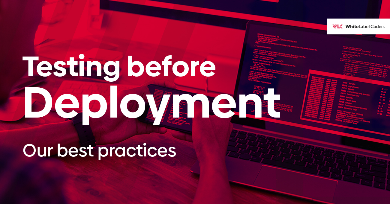
Before launching your website, you need to test it across different browsers and devices.
Steps:
- Open your index.html file in multiple browsers like Chrome, Firefox, and Edge.
- Use the Inspect Element tool to check responsiveness.
- Fix any layout or styling issues that arise.
- Deploy your website using GitHub Pages, Netlify, or Vercel for free hosting.
Once your website is live, you can continue making improvements and adding new features.
Summary Chart
| Step | Description |
| 1 | Set up your project with organized folders and files. |
| 2 | Write the basic HTML structure with elements like headers and sections. |
| 3 | Apply CSS styling to enhance the appearance of your website. |
| 4 | Add images, links, and lists for better user engagement. |
| 5 | Use CSS media queries to make your website responsive. |
| 6 | Test your website across different browsers and deploy it online. |
Conclusion
Building a basic website using HTML and CSS is a great starting point for web development. By following this HTML CSS guide, you’ve learned how to structure a webpage, apply styles, and improve its functionality. Keep practicing and experimenting to enhance your skills and create more advanced websites. With the right tools and dedication, you can create fully functional and visually appealing websites.
FAQs
Yes, but without CSS, the website will look plain and unstyled. CSS is used to add colors, fonts, and layout improvements to make the site visually appealing. HTML provides the structure, while CSS enhances the design.
You only need a text editor (like Notepad++ or VS Code) and a web browser (like Google Chrome or Firefox) to start coding. Additionally, using a code editor with built-in syntax highlighting and auto-completion can improve your efficiency.
You can use the <nav> element along with <ul> and <li> tags to create navigation links that help users move between pages. Adding CSS styles will enhance the navigation bar, making it more visually appealing and user-friendly.
Yes, you can use platforms like GitHub Pages, Netlify, or Firebase Hosting to publish your website for free. These platforms provide an easy way to deploy your project without requiring a paid hosting service.
The best way to learn is by practicing! Start with simple projects, follow online tutorials, and build your own personal website. Experimenting with different styles and layouts will help you improve your skills.
Use CSS media queries to adjust the layout and font sizes based on the screen size. This ensures the website looks good on all devices. A mobile-friendly design improves user experience and engagement.
No, you don’t need JavaScript for a basic website, but it helps add interactivity like animations, pop-ups, and dynamic content. As you advance, learning JavaScript will allow you to create more engaging web experiences.